June updates, new features and polishing
A lot has happened in the last few weeks, I'd like to share some of the best features and improvements

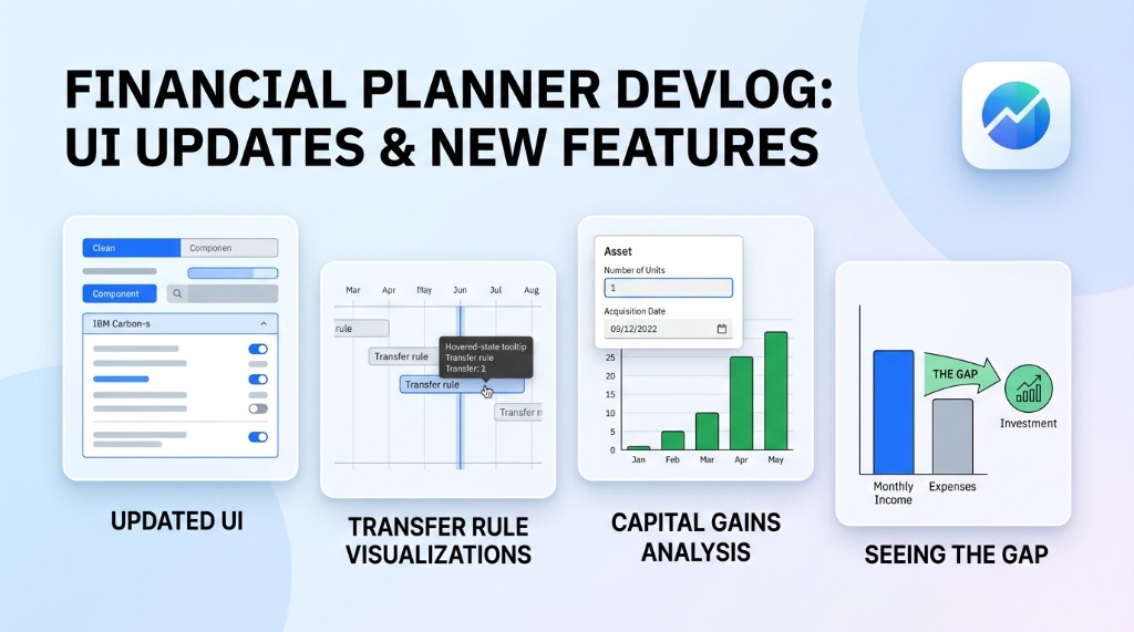
- Updated UI: I tried to make the UI look more coherent, clean, and simple. It is, after all, the first thing people see and—since it’s a UI-driven application—it is an important part of the user experience.
I used IBM’s Carbon Design System. It matched the “financey” look I was going for as well as the simple and easy-to-use philosophy behind this application.
- New visualizations of transfer rules: Transfer rules are defined in a separate UI block, but because they affect assets that are displayed in the timeline chart, there needs to be a way to indicate when and which rules apply to which asset.
One way of doing this is to add a thin line just below the affected assets. When hovered, it will show some details about the transfer rule.
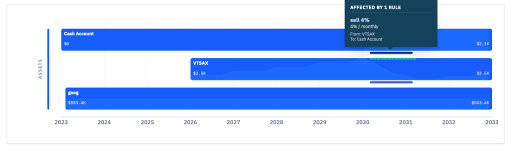
Transfer rules visualization
- Capital gain feature: This is a big one. Capital gains are an important part of anyone’s tax calculations. When we invest, the investments grow over time. That growth is the capital gain (or loss), which is usually taxed. EasyFinancialPlanner doesn’t support tax calculations for now, but with this feature it will display monthly and yearly capital gains on assets that are sold.
Selling assets is done through transfer rules. After all, selling an investment is just a transfer between your investment asset and cash.
In order for capital gains to be calculated, you will need to enter some more details about your investment, such as the number of units, the price (cost basis), and when they were acquired.
This can now be done in the asset creation dialog.
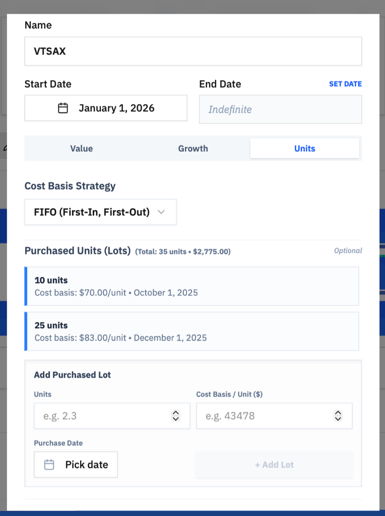
Unit details for capital gains
Once calculated, the capital gain details will be displayed in the timeline chart. The green bars indicate the month when the capital gain was realized; hovering over a bar will show more details.
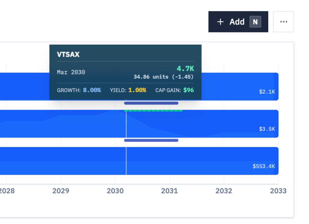
Capital gains visualization
- Seeing the Gap: A concept I found out about from the Donegans at Rebel Finance School. It’s fairly simple. If you take your monthly income and expenses, the difference is your gap. A positive gap is great, meaning you can invest. A negative gap is a problem and it might indicate you are going to get into debt. The gap is displayed on the Net Worth Projection graph:
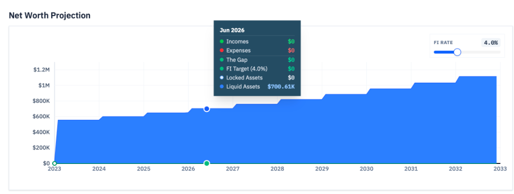
Net Worth Projection graph with The Gap
Overall it has been a very productive period. Early access is available now for anyone who want to try it. I’m looking forward to building more and opening the app for more users in the upcoming weeks.